compositional elements
rule of thirds
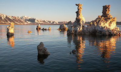
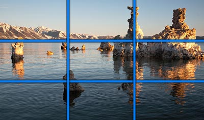
the rule of thirds is a compostional rule used in photography, This is a fairly basic rule that is used to make your images appear less static and to stop your eyes being drawn just to the center of the image.This is first done by creating a grid two horizontal lines and two vertical lines to create 9 pieces of the image. This now gives you four important parts of the image which you place on the lines you have just created this creates structure to the image. Most photographers place there most significant object in the center of the image this is called "center of interest" however when this is not used a the most significant object is off center it has been known to look more pleasing to the eye and it also forces your eye to follow the main subjects direction making the person viewing the image look at it for longer and makes your image more interactive with the eye.Such as in this image the most signification part of the photo which is the rock is off centered to the right as it is the largest part. When you first look at the image this draws your eye to the right and it really makes you look at the image more closely.
Leading lines,

this is another rule of composition using lines. This is used to draw the view to one specific part of the frame. Our eye naturally follow lines when we look at photos as they make us feel like we are part of that photo and makes it feel more interactive.Sometimes there will be an object at the end of these leading lines however this is not necessarily it every photo. These lines can be
horizontal/vertical/diagonal or curved. Diagonal lines have been known to add more drama to a photo where as horizontal lines can add a more calming affect to the image. As you can see the image i have chosen has 4 leading lines the three in the road and then the one going across horizontally below the moon The horizontal lines also add structure to the photo as they are the main factor of the photo that leads you too the moon which is the brightest part of the image.
Perspective

Perspective is the way our eyes relate to spacial separation and the relation of the size of objects within that spacial separation. Such as things that are further away seem to be smaller. Many people use forced perspective to create effective photos such as they are holding famous landmarks or the sun. This is all done with perspective this would be done by being fair away from the object but placing the hand in front of the lens making it bigger. The reason it appears bigger is because of your perspective view and how the photographer has took advantage of the depth of perception.
View point

The view point is defined as a angle, direction or stance in which you choose to shoot from. This could a high or low angle. For example this is a high viewpoint as it is looking up and the person would of had to shoot looking up. viewpoint can also be the way we perceive something i suppose it could also been seen as a point of view shot making the person viewing the photo feel like they are there looking at the object. This can be used very effectively when done right and using interesting objects a the main subject.
symmetry and Asymmetry


symmetrical photography is when if you split the image in two you would have the very same image on each side almost like a mirrored image, as shown here with the trees as they are in the same position on each side. Where are Asymmetrical is where the sides are similar but not exactly the same as you can see on the left image they are almost similar however one lamp has a bird on it. if we were to take that bird off the photo the image would be symmetrical. This can work really well within images as symmetry can create depth and an atmosphere to a image.
patterns and texture

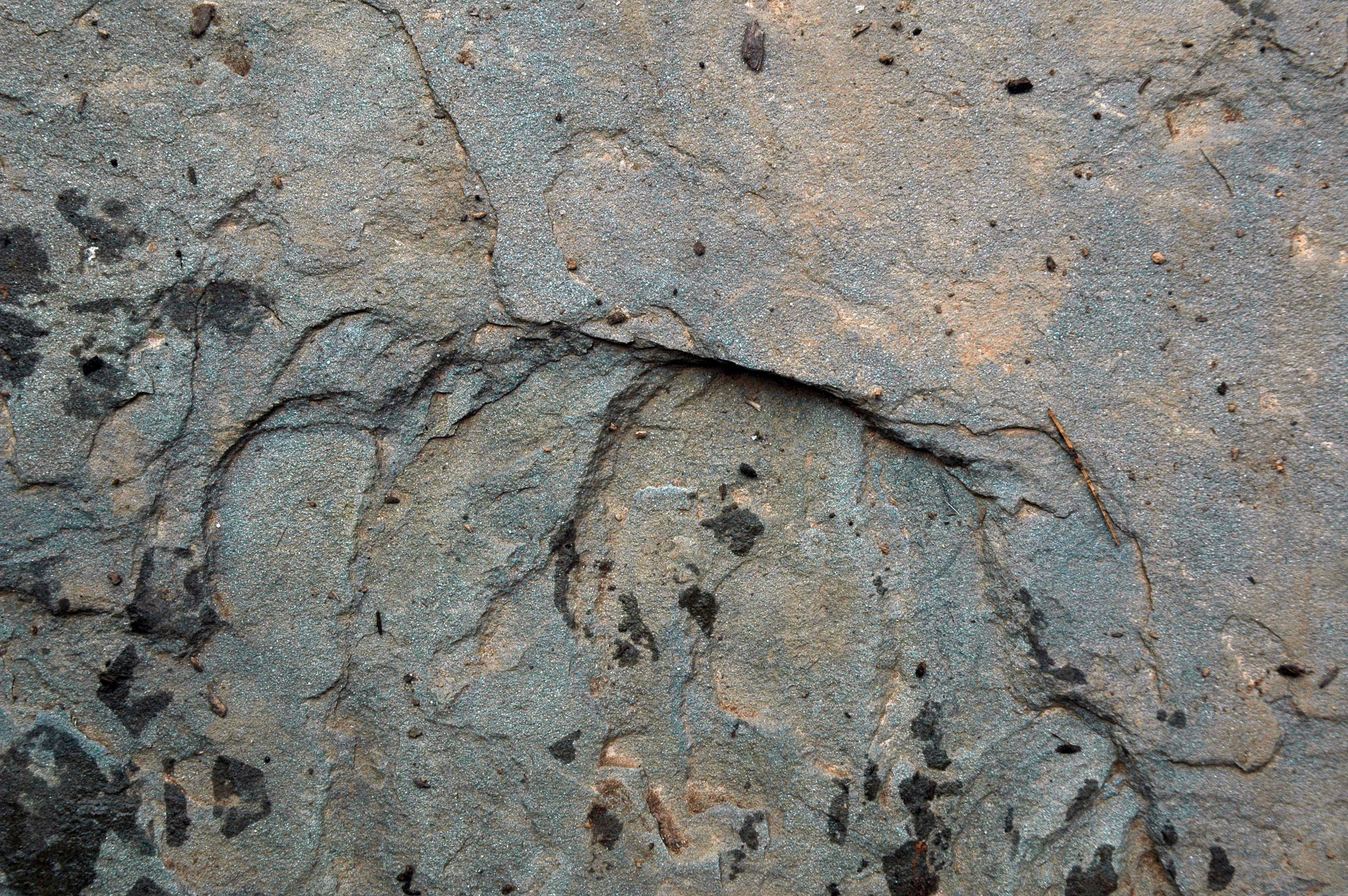
texture can create great depth and realism to your image. It also adds feeling to the image as it shows how an object feels in more depth and translates it visually. This also helps emphasize the features and details in an object, Leading lines can also be used to enhance texture by drawing the persons eye along the texture. Macro can also be used to create the same effect, To enhance patterns in your image the best way is to fill your frame as if your pattern is burning threw the frame. Again using leading lines will enhance your pattern more you should also look at the focal point of the image as your images need to be sharp to capture the pattern. Using patterns and textures can really make your images interesting and eye catching.
Depth
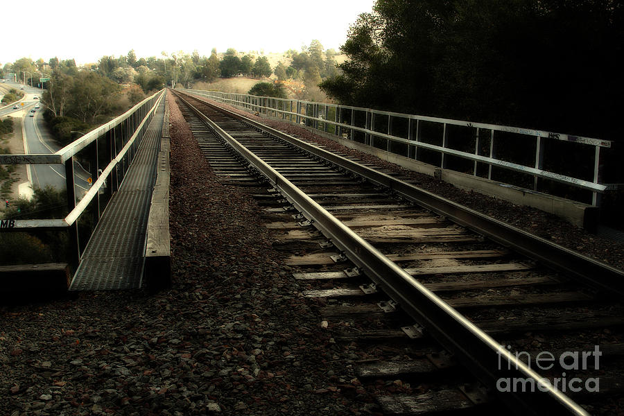

To create depth in your images you need to use depth of field this is where you change your focal length so your back ground is out of focus and you have one subject in focus. Also to create even more enhanced depth leading lines can also be used as this create dimension in your image or a view point. This is all create by your aperture setting for example to create the blur in the background you will need a small depth of field, I think is is a really effective technique for your images and it makes your images more realistic and eye catching.
Bill Brants
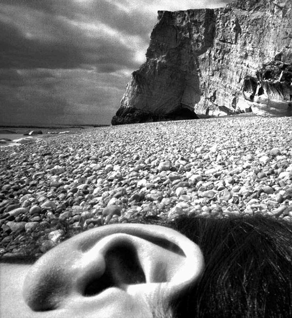
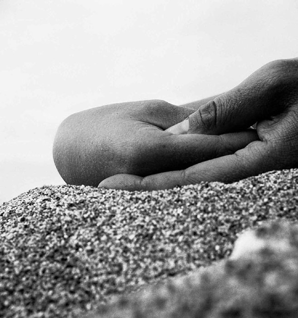
Bill Brants created images using body parts and scenic views but has shot them in a way that makes the body part appear bigger than the view this is all done by perspective and how he has used leading lines, height and diminishing lines all to create this effect. By forcing all these techniques together he has created a really interesting image and create a very surreal image. I really like these pieces of work as i think they are framed very well and i like how in the first image the ear is bigger that the cliff this almost creates a kind atmosphere that may make people feel a bit uncomfortable as it is not something we normally see. I also think the ear could represent a shell i this image which would be a symbolic object as when you hold a shell up to your ear you are suppose to be able to here the see,
I again really like the second image as the hands are positioned in a way that makes it look like a crab. This again is linking body parts with regular things you would normally find on a beach. I like how the back ground is white grey tone and the tonal range of the hands are quite dark as this makes the hands stand out more,. He has again used leading lines to frame his image which i think works amazingly well to his advantage as well as the uses of texture as his image seems more realistic and not as two dimensional These are really eye catching images to look and i think Bill Brants has put a lot of thought in to these images.
No comments:
Post a Comment