Showing posts with label Visual commutation. Show all posts

Wednesday, 8 June 2016

In this essay i am going to be comparing and contrasting 2 images around documentary photography. I want to explore what is the message within the image and also do we take the message within for granted? These images are images taken during war time.One image is by Don McCullin and the other is by Alfred Eisenstaedt.


Both of these images were taken in a pre-digital ere this means they are authentic and legitimate and there is no chance of manipulation unlike in the post- digital ere we live in today. “The invention of digital photography forever shattered the medium’s hold on truth,” (Sarah Greenough 2016) This point can be strongly agreed with as images can be manipulated so easily today and people question a lot of documentary photography and photojournalism as manipulation can be used to sway public and individual opinions. Documentary photography was originally made to make an impact on the public it was a way to show awareness of subjects such as war, poverty and famine it was a way to educate the world it focused on making raw and real image instead of creating a image that is pleasing to the eye it focuses more on speaking words however it has no expanded to documenting everyday life and doesn't necessarily have to be to create an impact.


The focus within these two images were war one is showing emotions of fear the other one is showing emotions of happiness as this was taken at the end of the war which show complete opposite. War photography is a very strong way to get emotions across it was also a really good way to educate people as photographers were thrown into real life situation to create images of impact to share with the world and create psychical pieces of evidence of history. "Granted, documentary photography does not always depict loss and despair. Realism, context, and timing are key roles that documentary photographers must always consider." (learnmyshot) i feel this can be strongly agreed with i feel realism is the strongest factor in documentary photography as it is used as facts and evidence if its not real then it's not documentary photography, timing is also important as for some documentary photography you need to be in the right place at the right time, this point shows that you don't need to show loss or despair to create strong images that cause impact which is the approach Don Mccullin took.


Here is an image taken by Don Mccullin of a shell shocked solider that was taken during the battle for the city of Hue in 1968. This image shows the impact of war without having to show any violence. Yet it still has that massive impact to the viewer.It also speaks words in this way. The message behind the image is that war is a serious issue and it's a subject that should be spoke about however you do not have to show violence and the real hard truth to get the message across. I feel this is taken for granted as in present day a lot of war photography contains a lot of violence with in and that the media feels that violence is the only way to educate people on the situation. The media use the "shock factor" to educate people as this is easier to sway public opinion even though what you're are seeing might now be true.The image is composed perfectly as it fills the frame really well, there is a really good use of depth of field within the image as the background is out of focus it almost creates a haze around where the solider is sat, which may relate to almost how the solider is feeling because is so terrified. The way the solider is looking into the camera adds so such more emotion as there is almost a glint of hope within the eyes.This solider does look genuinely terrified and its all within the eyes. Don Mccullin states "photography had been “hijacked” because “the digital cameras are extraordinary. I have a dark room and I still process film but digital photography can be a totally lying kind of experience, you can move anything you want … the whole thing can’t be trusted really.”(the Guardian 2015) This point does back up the point that film photography was more trust worthy when it comes to viewing them as it a very strong opinion as Don Mccullin does prefer shooting in film as it makes the images more authentic and in his opinion is a lot more honest. 


 This photo is taken in Time Square New York on V-day,it shows a American sailor kissing a woman in a white dress. This piece was printed a week later in Life magazine. This was taken moments after the announcement that the war with japan was over. This was an extremely joyous moment for the Americans that created spontaneous moments such as this one. This moment created emotions of happiness and relief. These two people are complete strangers which i feel makes the image even more iconic. The fact that happiness spread so quickly and everyone felt the same emotion at the same time. I really like the way this image is shot as it has perspective within it, i looks at using lines and rules of thirds to bring the viewer in, i find that this wasn't done unintentionally makes it even more eye catching.  This picture created a physical memory,a piece of evidence. I feel this image does show that happiness is contagious and that by all the others watching it shows it is important to share moments and create memories. "We never spoke a word,” he said. “Afterward, I just went on the subway across the street and went to Brooklyn." Glenn Mcduffie The independent 2014)  This point makes the image even more special and unique as these two people never conversed in conversation and it shows it was a real spare of the moment thing,a spontaneous moment shared between two complete strangers however it has now been made into almost an artifact.


In contrast with each other both these images show two completely different emotions that are seen as opposites,However they are both shown in a extreme form and the emotions in each image is clear. One is shown within the face and eyes as it is a portrait this focuses on shock and fear. Don Mccullin has chose to focus on one subject and his work is a lot more intimate and he appears to connect with the subject more, He shoots from a very personal angle. Where as Alfred Eisenstaedt has chosen a intimate moment but has chose to shoot it from a point of view,his moment is shared with other people around him but there is still that element of intimacy, yet his is psychical in the contrast to Don McCullin who portrays it within the way the image is shot., Don McCullin used his work to educate people as he wanted  the world to know just how awful the war was, yet the other is showing a moment for memory.Both images had a massive impact on the world.By both the images being film this means they are legitimate images and that they have no way been tampered with and i feel this makes them even more unique. As the two image are the subject of war i feel these are two completely different. Both the photographers have made history as now they have a psychical piece of the memory. I think one of the best things about documentary photography is that it is a reliable source for evidence and it allows us to document our lives and things we see everyday. The images also have lots of similarities as they're both set around the subject. The tonal range within both images is similar as the white is very bright and there is a lot of grey within the image. Both images are sharply in focus, They both show intimacy and share emotions within the image.


In conclusion both images are iconic and they are both extremely strong images and both have a massive impact just like the war did on the world. War was a massive subject that people needed to be educated on so these images are extremely important as they were both published in newspapers for the world to see. Both take a different approach yet are equally effective. Documentary photo allows us to record history however it is a lot harder since photography became digital as it is so easy to manipulate images these days. I do feel the Don Mccullins work was more successful out of the two images as it educated people his work was shocking but in a way that didn't show violence in any way, all his work has a theme which is he seems to focus on getting a glint within the eyes i feel this brings the view in and makes them feel the emotion he focuses more on emotion than anything else and that's what i really like about his work,His work feels a lot more personal, they are also extremely strong images. However Alfred Eisenstaedt work was still really successful just in its own way as it focused on sharing memories together and it looks at happiness and sharing happiness it doesn't make as much as of a impact however it is in a completely different context.


bibliography


“The invention of digital photography forever shattered the medium’s hold on truth,” 
  (https://collectordaily.com/rethinking-photographic-truth-in-the-digital-age/)


"Granted, documentary photography does not always depict loss and despair. Realism, context, and timing are key roles that documentary photographers must always consider." 
  http://learnmyshot.com/why-documentary-photography-is-important/ 


"photography had been “hijacked” because “the digital cameras are extraordinary. I have a dark room and I still process film but digital photography can be a totally lying kind of experience, you can move anything you want … the whole thing can’t be trusted really.”
https://www.theguardian.com/artanddesign/2015/nov/27/don-mccullin-war-photographer-digital-images


 "We never spoke a word,” he said. “Afterward, I just went on the subway across the street and went to Brooklyn."
http://www.independent.co.uk/news/obituaries/glenn-mcduffie-wartime-sailor-who-claimed-to-be-the-man-in-alfred-eisenstaedt-s-famous-times-square-9199854.html

Rockers, Soulheads & Lovers: Sound Systems Back in Da Day

 Rockers, Soulheads & Lovers: Sound Systems Back in Da Day looks at the golden era of African- Caribbean sound system from the 50's to the 80's in London, in the exhibition consist of both visual and audio.Although sound systems originated in Jamaica, it would form its own expression and identity in Britain and with reggae as it’s cultural foundation it has since absorbed other black music genres: Soul, Funk, RnB, Hip Hop, Jazz Funk, House, Jungle, Garage, Drum & Bass, Dub Step, Grime. The title, Rockers, Soulheads & Lovers, represents the diversity of subculture within sound system


This exhibition was really interesting as it consisted of both video and images and also artifacts. The message through out the exhibition was clear. The images were composed really well and all had a good depth of field within them. There was a lot going on in each image however this made you take more interest within the image. I really like the way they mixed audio and images together as this made you understand the exhibition more.

Larissa Sansour: In the Future They Are From the Finest Porcelain


Artist Larissa Sansour was born in Jerusalem and her practice is underscored by the urgency of Palestine's political problems. She typically deploys dry wit and pop culture references in her work as a means of cutting through cultural divides and connecting the international community with the universal relevance of this situation. Allusions to comic strips, sit coms and Hollywood films feature heavily throughout Sansour's previous works, however this exhibition focuses specifically on her more recent exploration into the genre of sci-fi.   (http://www.nae.org.uk/exhibition/larissa-sansour-in-the-future-they-ate/96)


These images where printed on giant aluminium sheets which I thought looked really effective and made the images a lot more detailed, the clarity of the images were amazing, the images had a really eerie feel to them and as the pieces of work were being exhibited a video was also featured, the music from that added the eeriness and the atmosphere of the room, I thought this was a really good technique to use. All the images where made up by all separate photos and there were so many images within in one image this must of  been so time consuming and must of taken a lot of patience however you can tell this by the amazing finish of the image.  I really like the idea of the image as it looks at  "resistance group on the brink of the apocalypse, burying elaborate porcelain which is suggested to belong to this entirely fictional civilisation. Their aim is to influence history and support future claims to their vanishing lands" http://www.nae.org.uk/exhibition/larissa-sansour-in-the-future-they-ate/96

The art movement of Dadaism

Daddaism first came about in 1916 in Switzerland, this was a reaction to world war 1 and nationalism as this is what many people thought led to the war it was also a reaction to the horror of war They reacted to this by making mockery images and ones that didn't make much sense these images were anti war, these were often made by putting lots of images together in the style of a montage put t was also expressed threw poetry, sculpture and paintings.It was a protest of the horror of the world this can also be looked at a form of expression as it was a rebellion and people expressing their opinions and feelings. It was the first art movement not to focus on creating eye pleasing images however focused on questions on society. It focused on the disgust of social, cultural and political values and dada was designed to be misunderstood and it was the complete opposite of what art stood for.It was designed to insult and provoke sensibilities. I was often used to reflect life however in an extreme and outrageous way.


These images have been created by Hannah Hoch who was a German artist and created photo montages, these are created by placing lots of different photographs together her worked criticised the mass culture of the beauty industry. Her work centred a lot around women and same sex couples. however she did look at mixing female and male bodies in her work. I really like this style of work I feel it is very unique and extremely surreal as it is loads of images placed together to make one big image. I like that the image tell a story without any real meaning. The images are extremely
expressive. I find the find the first image very simple and plain yet it does speak a lot within the image even though it is only 4 images placed together these images look like they have been cut out of magazines or newspaper. The colours in this image really go well together as bluey black and brown really complement each other. I also think the rustic edges to the images add to the effect


 I really like this image as I fee it says a lot about modern day and the beauty industry even though it is an old image. The image is simple but I prefer her minimalist work than her really loud and busy work as I feel her simple work is easier to read. This image is made up of 3 images yet the image has a very clear message. I feel this image wants to portray labelling in the society and the beauty industry. I really like the way she has layered these images but they are cut out really finely unlike some of her other work this links in with the fact the beauty industry is very precise and a lot of perfection is featured within the beauty industry. I also like the shades in these images as they are quite pastel almost like a polaroid.


 I really like this image as I feel it as been place together really well the way the eye is big and so it fill the hair making it look like a face. I really like the way the eyelashes on the eyes are really bold as this adds texture to the images. I also like the rustic edges on the hair. I feel this image speaks about beauty within society and how women are portrayed in the media however it has taken an approach that makes it seem really outrageous and exaggerates each feature. Almost like it is taking the mick out of the media and beauty industry.


 These images were created by Raoul Hausmann who was originally from Vienna however moved to Berlin at the age of 14 his farther was a painter and I feel this may of lead to his creativity as he influenced it off his farther. I really like this piece of work as it is done in black and white I feel this makes the images blend better together as you don't get the different shades of printing within some of the images. I don't really understand the image as I feel it very surreal however I do like the images are framed and layered together this gives the image a lot of dimension to the image. the compositional rule of rule of thirds is used within the image which makes the image more eye catching I like the fact this technique has been use even though this is a man made image it shows he has really thought about placing the images in the photomontage.


I find this image very strange and surreal and almost ugly, I really do not like the colours in this image as I feel they make the images really big and gaudy however I understand this was needed to make the image stand out. This image again doesn't really make sense however I feel it was something to do with the horror of war it did this by juxtaposing the images and almost mocking the war by making these outrageous images and I feel the face of the solider reflects on how they felt when they came out of the war as most suffered from shell shock.The images themselves has been really thought about when being placed on top of each other and they do work really well together. I like the way the eyes and mouth have been used in this as they look really outrageous and gaudy.These images are really surreal and I feel Dadaism was very much like surrealism as it was so outrageous and nobody quite understood the meaning behind it.

visual communication


Martin Parr


Martin par was born  on the 23rd may 1952 he is a British documentary photographer and photojournalist, he is known for his very intimate approach to modern day life and looking at the social classes of England. He has around 40 solo books published and his work has been in 80 exhibitions world wide. Here are some shots he took in Costa Blanca Benidorm these are fairly recent photos which are very similar to his photo series Spain. Benidorm. in 1997. I really like all these image as they are all candid and natural, they look like a spur of  the moment shot. I also like the fact they the aspect that no one cares what they look like when on holiday. This show real people and body confidence. I really like how the people in the front of the frame are out of focus in the right two images this creates more of an atmosphere and makes you focus on the point that is in focus also by doing this, this adds layers to the image adding dimension. In the bottom left image i really like how the first thing that catches the eye is the mans bright orange shorts and the green behind them. This adds a burst of different colour to the image. I like how busy the image yet it is not an untidy image. I also like all the different skin tones in the image which creates a warmth to the image. I love how the top left image is angled as this is more on an aerial view i think this really makes you feel like an outsider and like  you are looking down at these people. All these image do have a lovely warmth feeling and really shows different social classes all coming together and doing the same thing,


John gossage


John Gossage was born in New York city in 1946, he is very well known for using his photographs to explore under- recognized elements of the environment such as abandoned land, debris, rubbish and graffiti and looking at the relationship between architecture and power. This series named " The pond" was published in 1985. I like how all these photos do not show the stereotypical beauty of an landscape instead it shows reality. I like how these images are in black and white this creates more of a mood to the image and almost an spooky atmosphere to the image. I like the contrast of having a beautiful landscape but it being covered by dirt and rubbish. All the images are framed really well and they are a good example of using the rule of thirds especially the bottom left image as you view it in 3 steps first looking at the grass then the water then the trees and sky. These images also have lots of layers of different textures within them i think these textures are brought out more by the images being in black and white.


Wednesday, 11 May 2016

Art movement between the 1900 to present day.


An art movement is a  certain characteristic or style within art this will have a certain philosophy  or a goal.These would be created by a number of artist threw a certain period of time that can range from a few months , year or decades. These were very important as they showed the progression of art.

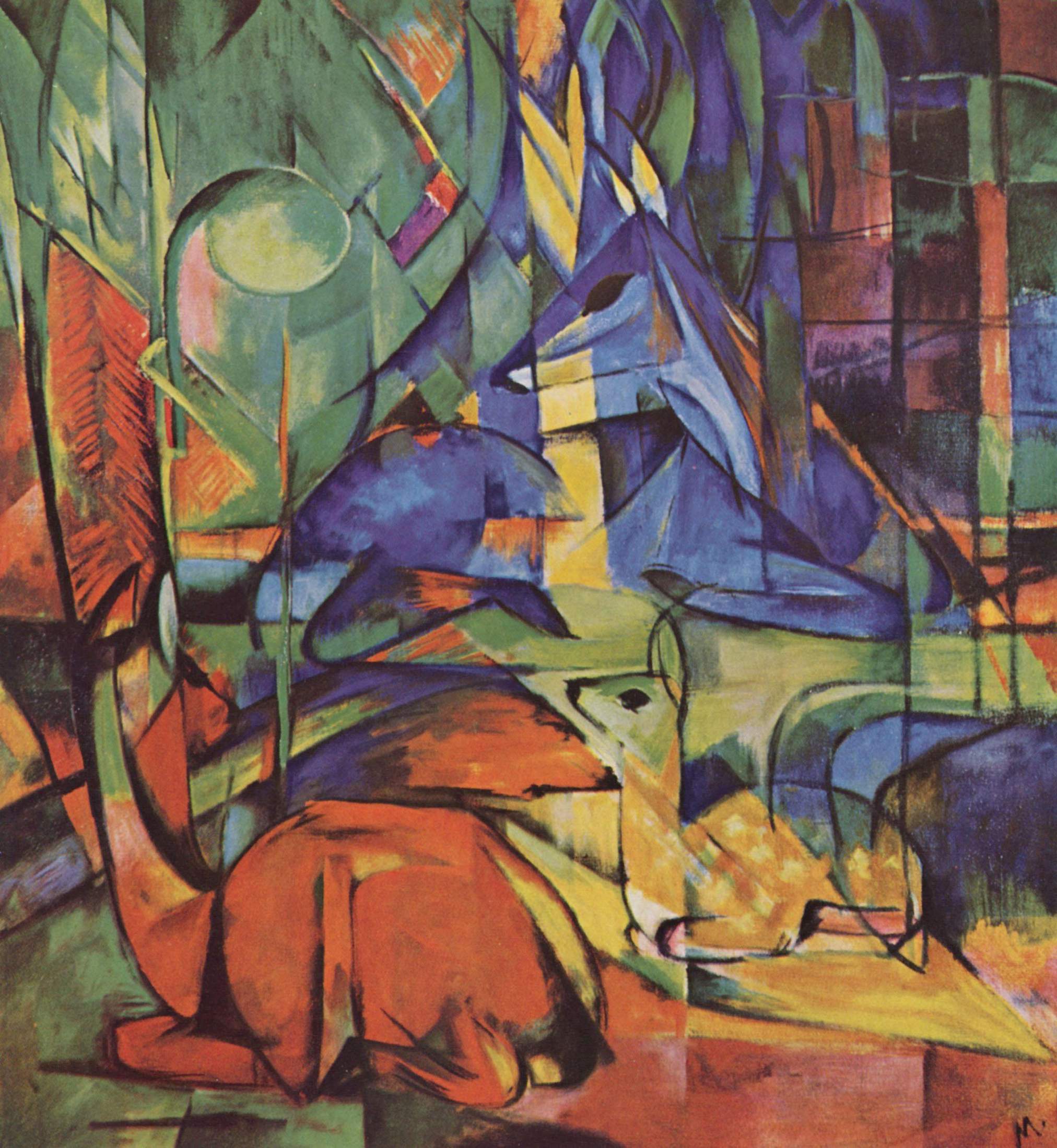
One of the first Art movements in the 1900's was expressionism which was known as fauvism for a short while before. This movement made artist stray away from the traditional art and allowed them to express emotions with bright and extremely vivid colours and subjects creating these emotional images. The aim of these images were to express "personal feelings about the object painted, rather than merely record his observation of it. Thus, in order to achieve maximum impact on the viewer" (http://www.visual-arts-cork.com). The prime time for this movement was 1905 to 1925. This work focuses less on reality and more on emotions. This is achieved threw distortion, exaggeration and fantasy threw all these vivid colours this started art should now come from within. These pieces of work were very distorted and quirky. The inspiration for this work was founded in European art and culture and tribal art.

This work first started with artist such as Vincent van Gogh, Edward Munch and James Ensor who brought this unique style to life who were brave enough to break away from the traditional styles of art. A lot of the work showed emotions of frustration and anxiety with these fast brush strokes and aggression this was so shocking to people as it was the first step away from traditional art.


I really like these pieces of work as they show boldness and ambition as they strayed away from the traditional style of art and the injected these amazing bright colours to create emotion and fantasy into their images. I think these pieces are so unique and are really pleasing to the eye they also make you really think about the images and looks at them in greater depth as at first glance some of the image are not as clear and I think this makes you appreciate the art work more as you take more time to look at it and take it all in.


symbolism was a art movement in the 19th century this was very unique just like expressionism however this focused on using forms, lines, shapes and colours to suggest ideas or meaning. This again was another way to express emotions rather than using realism to express these feelings. Their work was extremely personal. "The subject matter focused mainly on religion however it also focused on a dream world of feelings of being morbid, death or evil" (http://www.theartstory.org//) Some of the artist who were well know for this kind of work were Paul Gauguin, James Abbott McNiell Whistler and Odilon Redon. This art movement was opposite to expressionism as it did not consist of bright colours or didn't express fantasy as this focused on death and evil and had depressive tone to it.


 all of these images have an atmospheric feel to them and almost and eerie feel to them. They all of consist of quite pale colours and they have a lot of pale green yellow and brown within. None of these images have a clear narrative to the images which I like as I feel you have to really to think about these images. These images are really symbolic. However they use simple objects to make it effective and focus very much on fantasy however it focuses on the dark side of fantasy.


 Surrealism first started in the 1920 this movement focused on dreams and fantasy however in a very different way this looked at dreams and the unconscious mind. These images were very out of the ordinary and did not make much sense as they were things people would of never seen before as they were so unrealistic. "The aim was to make dreams into reality by creating this "super reality" (http://www.artmovements.co.uk/surrealism.htm). This particular art movement was founded in Paris by Andre Breton in 1924 and can also link back to French poets who put the idea of surrealism in words. The main artist threw this movement were Salvador Dali, Max Ernst, Rene Magritte an Joan Miro who played a big part in this movement that is still making an impact today.


I really like these pieces of art as they don't make sense at all yet you can understand what is going on in the picture.The narrative of the image is so unclear and they do that the element of fantasy into them however this is linked in with confusion.. I also like these images are very out of the ordinary each image is unique. Most of the images have a lot of blue within the images this adds a calming effect to  the images which links in with dreams as sleep is usually associated with being calm. I think this art movement has had the most impact on the progression of art as it still exist today and is still used in many ways.


Photorealism was first founded in the 1960's This was an art movement where artist would create very realistic painting inspired by a photograph however these were flat images. With brush strokes almost unnoticeable these painting looks accurately like photos."Photorealist paintings take many hours to complete, requiring intense concentration and in-depth knowledge of the materials. The end result can be breathtaking and wondrously fun."and. "Photorealist art is also often referred to as Super-Realism, New Realism, Sharp Focus Realism, Verism, or Hyper-Realism" (http://www.art-is-fun.com/photorealism/).  These paintings usesally consisted of objects, landscapes and sometimes portraits. These pieces of work needed great planning unlike expressionism that was very spontaneous when it came to brush strokes. These images provided great detail. Ralph goings,Richard Este and Charles Bell who used oils or arclylic and often displayed them as large images as they were so full of detail the surface was often smooth as they did wanted no visible brush strokes so they looked like photographs.


 These images are truly amazing they have so much detail within them, its hard to believe they are not photographs. They are so crisp and clear that they always represent reality. The colours and shading in all of these images are spot on to create these life like images and  I think this is what makes this work so significant. Some of them you really cannot tell if they are paintings. The process to create these images must of been very time consuming but it really shows threw with the effects of this method.


Pop art emerged in the mid 1950s in America this was an art movement that was in a post- war society. It looked at creating pieces of work celebraiting everyday items such as drink cans, soup tins and wash powder. These images are usally associated by bright vivid colours and almost gaudy esicially red and yellow these were made to stand out. "Andy Warhol, however, who really brought Pop Art to the public eye. His screen prints of Coke bottles, Campbell’s soup tins and film stars are part of the iconography of the 20th century By embracing commercial techniques, and creating slick, machine-produced art, the Pop artists were setting themselves apart"(http://www.artmovements.co.uk/popart.htm), Roy Hamilton and Jasper Johns also played a big  part in creating these eye catching images.


I really like this style of work however I do feel this work is maybe a bit garish and brave as the colours are extremely bold. I do prefer the pieces of pop art that are not as bright. I really like how cartoon this looks with blocked colours and the really harsh shadows this creates depth to the images. The colours in them almost add a element of surrealism into the work as they are not the normal shades found in the images. I can see why these pieces would be used for advertising as they are very striking.


by looking at all these art movements i can see why each has contributed to the progression of art.They are all similar in the way that they are all so unique and all have made drastic changes to art. My favourite movement has to be photorealism as i find the images stunning and so realistic and to make a pieces of art so precise must take a lot of patience i also really like the inspiration behind these as they are inspired by photographs. its almost like creating a photo without having to use a camera. This makes the images so unique as they take so much care in creating these images. In contrast my least favourite is the pop art as i feel it is to garish although i feel the earlier work is better such as the work of Andy Warhol as i think these were not to extravagant. Art has progressed massively threw the years and it seems as the years go one some elements seems to repeat themselves such as bright colours which featured both in expressionism and popart.


sources
http://www.visual-arts-cork.com
http://www.art-is-fun.com/photorealism/ 
http://www.artmovements.co.uk/surrealism.htm
http://www.artmovements.co.uk/popart.htm


Visual communication Research blog 3 Nicolas Ruel and Yongjun Qin

HOLY FIRECASTINGCONFESSIONMIRAGEMANDELA BRIDGEMAZE


Nicolas Ruel was is a Canadian photographer born in 1973, he studied photography and national relations, His first work was published in in 2000.  In  2007 he started a series featuring the images above called "8 seconds" this focused on double exposures this series ran from 2007 to 2015 and consisted of so many images. This has featured in single and group exhibitions, in Canada, Europe and the USA. These are printed onto big stainless steel sheets.


I find all of these images really appealing as they are all so vibrant and there is a lot of colours within every image. They are amazing pieces of fine art photography. He has traveled to cities all around the world from London to New York i think this shows Nicolas ambition within his work and what he wants to achieve. By using a long exposure of 8 seconds he has been able to create these almost dream like images. I really like how some part of the image look transparent almost they are a vision or something someone was has imagined.  The composition of all these images is done well as a lot of them consist of rule of thirds. They are also shot at a wide angle so you can get more cityscape within the image. I really like these images as i feel they are a unique way to look at the world these images create a dream like effect which is very calming. In my opinion i feel these images are so appealing and it does make you want to go and visit the city.  He said he wanted to photograph familiar images to exposure there hidden architecture and i really feel he has pursued this.  I also really like the way he has printed on stainless steel sheets as it would give more feeling of dimension and time. As a series i feel these images work well together as they are all very similar get so unique when they stand alone.


these images are extremely dark and have a dismal feel to them, they are also quite surreal, the depth of field in some of these images are truly amazing this creates an atmosphere and adds a erey feel it,  these images don't really have a narrative within them so you have to really think about these images. The composition in these images are done really well as this bring your eyes into the picture rule of thirds are used quite a lot within his images , this adds structure to the images, this images mainly focus on depth and dimension which creates an atmosphere to the images. I feel these images are very strong when it comes to emotions and surrealism.