Thursday 28 January 2016

My Still lifes


these were done in the studio with a snoot and a soft box by having the snoot facing directly onto the objects this created glimmer to the objects the soft box created soft light on the objects too. we looked at moving the snoot around see how that changed the way the objects look with the lighting and lighting up different bits of the object we connected to the flash kit to the soft box. The objects we used were much like the kind of things that would of been used in the vanitas which was a still like painting done in the 16th and 17th century which usually used objects linked with decay and death  such as weltering flowers and skulls. Here we also wanted are images to look some what like a painting we did by are settings used. I did turn the snoot up at one point making the direct line of light brighter however i think this was disadvantage as i prefer the images darker as they relate more with the vanitas paintings as they looked for spooky and very soft. I feel by turning  up the snoot this washed my images out a bit to much. creating an affect  i didn't really like The light almost sculpted the objects making the look for bold.However i really like the different textures in the images.

Still life


Still life
              A painting,drawing or photograph of an arrangement of objects typically fruit or flowers.


Vanitas 
    

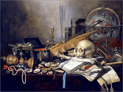
Is a type of symbolic work of art especially associated with still life paintings in the Netherlands in the 16th and 17th century. These paintings are usually enriched with morbid symbolism such as skulls, rotting food and dying flowers.The objects can also be seen as worthless objects. Other elements in the vanitas include wealth and wellbeing, earthly pleasures and sometimes eternal life.The skull is the focal point of the image and the main symbolisation as it is the universal symbol of death. There are so many different textures and forms within the vanitas.


 Irving Penn


His still lifes are very precise and organised and the composition is amazing in these image and there is amazing attention to detail to the images.I really like these images as they have a really strong contrast to them and they are bold images and really do make a statement within them. The images don't have a clear narrative. He looked at objects that obsessed him objects that have unusual forms  as he managed to see the beauty in all manners. Some of these pictures are almost disturbing but not overly disgusting as the disturbance is more from the way the images are lit almost in a clinical way like they are being operated on. They are definitely eye catching images as they have all these really bold and bright images the are also very very unique because of the way the images are lit,composed and the amazing colours in these images so much thought has gone into these images as they are very precise. These images are nothing like i have seen before and are truly striking.


John Blakemore


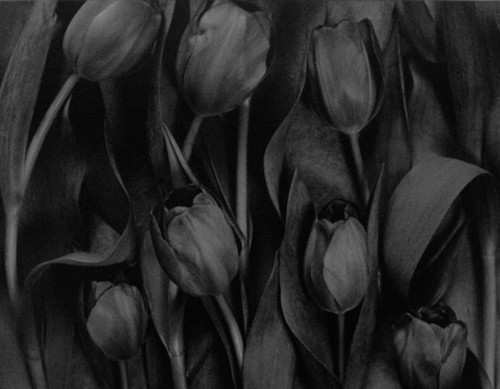
In contrast to Irvin Penn's work these are the complete opposite there is a very grey tonal range in the images they almost have a depressing mood to them as they lack any colour at all however i do like how this contrast with flowers how they are perceived as these big bright and colour objects yet he has chose to shoot them in this mood horrible grey tone. I don't really like how the images look psychically as i feel they lack character compared to Penn's work who is so outstanding and striking you could not miss them if you were to walk past them. I do however feel these images could be perceived as very elegant and delicate and they images do have a lot of texture in them and he has really thought about how  the images are framed and the flowers are placed just like Penn's has in his images as well.

City Apeture


Here i focused on aperture when taking photos. Here i walked from Hyson green back into Nottingham town center it was interesting to see the contrast between both when it came to wealth as within a few meters there was a massive difference. The light wasn't very good this day so all by photos were shot at a setting ISO 400. I really like my first image as it was a very quick and random shot that turned out well.I like the way the image is framed and the textures in the image also i think there is a good range of tones in the image. I shot this at an aperture of 5.6 and chose my focal point of the two small windows. I really like how this turned out as the rest of the image is not really out of focus and you can still see the detail in the building. I do like the framing in this image however i maybe would of liked it more if the building was in the whole frame or so i had more sky in the image. I also like image 15 as i like the angle i shot it at, as it is a side on shot showing the demolition of part of the building.This building is abandoned and covered in graffiti which i think makes the images very atmospheric and again by shooting in black and white adds to this. This was shot of a small aperture of f/11 which let me get everything in focus and the detail i wanted. I used a shutter speed of 125 of a second which was fast enough to freeze the cars still in my image. I think it would of also looked quite interesting using a slow shutter speed and getting a motion blur from the cars where the building is stood still this could create a spooky feel to the image this is what i would do if i was to recreate the image again.

Thursday 21 January 2016

William Eggleston


William Eggleston is an american photography and focuses very much on colour in his images, his images have a very artistic feel to them with the way they are formed and framed. i find the colours interesting in these as they are bright yet appear pastel the images have a very 1960's feel to them by the style to them. They are strong striking images with the way they look. most of his work is of objects not really people his images tell a story without any people in them which I really like as it proves not every image needs people in them for a narrative or not every story is told in the eyes as many people think. His framing is done really well and you can tell he has really thought about it. he used a film camera which I really the effects it has given.  I love the vintage feel to the images. He has been called "The Genius in colour " for his strong and striking colours and as how colour was not used as such as aspect before William came along. His use of colours have been described as " near to the point of hysteria" as around this time it was such an outrages thing to be doing. I also love that his work has no clear or no narrative to them. These peaces are very abstract in the way they are formed with all the lines and compositions he uses, I also find the inspiring the fact he photographed real life and not just pretty things.