Pop art is an art movement mainly associated with New York in the early 1960's. This was an abstract expression. These were images created using mass media and popular culture this was a major shift for the directions of modernism and this strayed massively away from traditional art. This movement mixed every day objects and things of popular culture into fine art. This art form has been known to have a "hot" expression to the images are they are are full of vivid colours and extremely bold lines that brought out elements of contemporary culture. This art movement became one of the most popular yet as this made people believe art could be made from anything this was became popular like any other famous art movement as it went against the status quo. Pop art was very similar to Dada's surrealism as it looked at both abstract expressionism and cubism. This was the first movement to go world wide. They wanted people to know that the idea behind the art was more important. These pieces of work would be created by lots of different things especially scrap materials. This style was really good when used for advertising as they were very striking images.

I find Andy Warhol's style of pop art very interesting as it was such a unique style that took the world by storm. By using layers and garish colours Warhol created these bright and unusual images. Warhol was a religious man and i feel this shows threw in his images as he uses his style in a way that makes the subject look like an religious icon as they are the main focus and they have a real surreal look to them, He was a very shy and anxious person which i feel really contrast with his work as his work is so bright i think this is his way of expressing himself without actually having to be verbal. Warhol is probably one of the most famous artist when it comes to pop art as his work is so distinctive and he changed the view on traditional art.
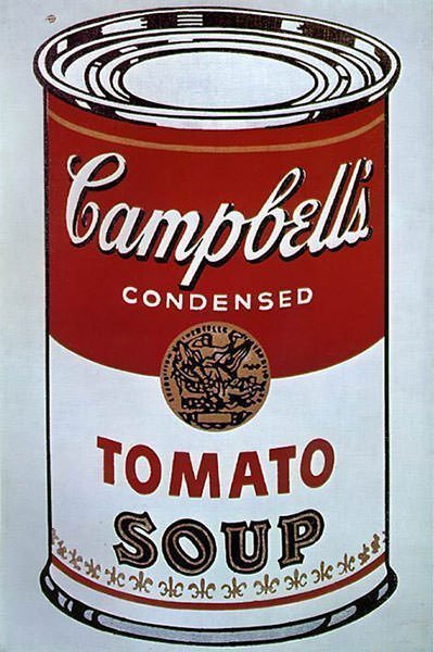
Here are two of Warhol's most famous images. I really like the photo of Campbell's soup as i feel this is a lot more toned down however you still have the really dark shadows and bold lines that is the a important element to pop art. I also really like the block colours in the images and how they is only really 2 colours in the image which is brown and red. However these colours are bright so they stand out, This image almost looks like a cartoon i feel this is created by the bold dark lines in the image. He present 32 of these images all different flavors however other than that the images where pretty much exactly the same, I find his choice of repetitions when displaying this work interesting as he used this method a lot in his work which may of reflected his personality and by displaying them this way it made a massive impact on the viewer and i feel this was Warhol's way of expressing himself.


I find this work very unusual as they do not have the bright and vivid colours which a a main characteristic in pop art. These are very surreal and quite plain when it comes to colours. I think was one of the very first pop arts before it progressed into these very garish and striking images in contrast to Andy Warhol's work. These images look like an array of images cut out and and stuck on top each other. So all the layers added together make this very surreal image. I do not really understand these images however i think this is the whole point of pop art the images do not have a narrative.
In the first image i like the use of black and white with colour i think this makes the image more interesting as Hamilton has decided to use both as it is not usually something used normally and breaks the "rules" of making you stereotypical great image. They're are a lot of layers and textures which i think adds more dimension to the image. i wouldn't say i like this image however i do find it very surreal and interesting. The second images has a few more bright images in it. It almost looks like a updated version as the edges of each image is smoother and the colours are brighter again this image does not make sense. I think the ideas around these images are really interesting and i would of liked to know if Hamilton understood himself what was going on these images as they are so surreal.


This work is done by Roy Liechtenstein out of all the work i have looked at this is the one i like the most. I really like his use of bright blocked colours and dots. They images are very comic strip like.
These bold and extremely bold lines these made these images very pleasing to the eye and gave everyone individual impressions as everyone has different ideas to what these images. This make these pieces of art unique to each individual I like how these image fill the frame making them even more striking as there is not loads of white space in the images. i like how the image i have chosen are kind of opposites as one is very bright and a few of different colours and the other one is just really 2 main colours with a pop of red. I really like both these images. Especially the right image. I really like the pale blue in it and the pop of red. i also like that he has used blue and the image is associated with water. I think the blue also tones down the extremely bold lines so they're not harsh but still create the same effect.These lines add dimension to the images even though they are very flat. i also think his uses of dots for his skin in interesting too as creates another element and adds a texture to the image.
Over all i really like the expression of pop art and i find the work really interesting.I think was such a good way for artist to express themselves especially ones who had a shy and timid personality like Andy Warhol. I think the art movement is probably one of the most influential art movements as it changed art and the way we look at art forever. It was a really good way to express popular culture but making the images striking so they became appealing the eye and pop art is still a very popular thing still today. Pop art has influenced everything from product photography to album cover and even mobile phones as now we have software where we can turn ourselves into pop art. Pop art has really had the biggest impact on the world out of all the art movements as it changed the way we look at everything i think the most it has influenced most is advertising as now advertisement is bright and bold as ever and needs to be to get any attention these days.
No comments:
Post a Comment